MOTION GRAPHICS + 2D TRADITIONAL ANIMATION. A CASE STUDY
My short “The Other Side” entwines the use of an expressive 2D style with the motion graphic, the after effects shape based animation. The latter is in heavy rotation in today’s animation industry for its effectiveness and efficiency- I set out wanting combine 2 styles, presenting hybrid techniques of animation.
Mixed media is a fascinating genre of art, to me, using and working with the materials available to you to tell your story, paint your ideas- whatever you have to hand.

The idea then, came very much as a plot. A man walks up to the camera, where a chicken in the foreground gets kicked in the butt.
I knew I wanted to combine different animation techniques, harbouring different styles to describe character.
Bringing this creation to life definitely took me a few wrong missed steps. The effect to over lay illustration over a pre animated chicken I animated in After Effects, gave the chicken more than just movement keyframe to keyframe... I could illustrate a personality and combine using textures to create and break the illusion of this craft.
 |
  |
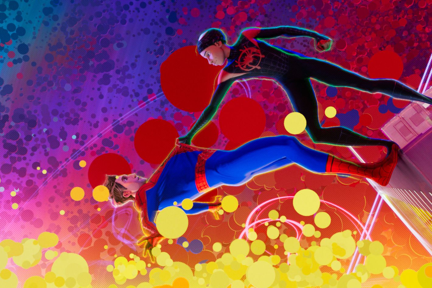
After noticing animated stories were using hybrid animation such as Spiderman Into The Spider-Verse and Netflix's Love, Death and Robots, I wanted to explore the hybrid possibility of using 2D frames and animation to enhance the visual identity of a story. Their use of combining traditional techniques of animating on 2's combined with 1's also appealed to me, as it feels refreshing to see engaging motion referencing stop motion techniques.
Rough Animation - Frame By Frame.
From drawings, sketching down the bones and expressing what will be in frame was very much my animatic. I found keying out the man walking in perspective to be very effective and could use it as a guide for composition when animating and designing.

On reflection, the animation could have been more detailed and the warping of perspective pushed even further. Creating animation as though you're filming it on a wide angle lens is what makes my pursuit with 2d such a thrill. With this warping distortion i aimed to capture Masaaki's sense of perspective distortion, exaggerating the size of character body parts to extremes.
 |
| Masaaki Yuasa's Ping Pong The Animation |
Motion Graphic.

The style frames i created, illustrated both characters and emphasising quick strokes and exemplifying a contrast between two materials. Here: gouache and pencil in Photoshop, as well as using a charcoal to define the man. These looked very effective and i'm glad a pushed for originality in these frames as i really had fun exploring these styles.
 The 2d technique became the basis of drawn style i then rotoscoped over the pre-animated chicken and expressed movement and direction with lines and strokes. I also explored impact action frames, contrasting what was on screen which highlights the intesnsity of the action, adding weight to the violence.

First Pass.
The first pass threw me some challenges after visually seeing the animation styles in one place. Matching the timing to get there when exporting in different software became tricky and i needed to find a way to overlay the illustrated layer. Setting the layer to replace the moving graphic, I realised was more effective and gave a very powerful illusion of erratic movement; clucky and absurd- i characterised the chicken with cluelessness to its surroundings enhancing the shock of the abuse to this animal unfolding.
Final Draft.

Finalising the animation took courage as i honed in on what i was initially striving to achieve. When i first set out: 1. A 2d man walks up to the camera 2. an after effects graphic chicken gets kicked in the butt.
Plot told, and the styles bleed into one another- even adding the touch of a falling feather, which i do wish i had made flutter a bit took look less like a leaf.
Adapting techniques for the future i will definitely use these together, it creates an engaging animation for the viewer and allows the animator even more control at ensuring the visual information is expressed originally.


Comments
Post a Comment